
Creating a Section Aware webpart in SPFx
Recently, I built a web part for a client, which led to a discussion about why the web part background was static white, which did not reflect the branding on the page. My quick fix was to just change the color manually, but now I wanted to know more about how I could build webparts that are aware of the area that they are in. It turns out, there are several options, depending on the capabilities needed and the web part framework.
BLAH BLAH BLAH! Just take me to the solution!
Theme variants
Regardless of how you want to use the Section based colors, the primary method to access those colors is though the ThemeProvider object, which is already included with the sp-component-base package.
First, update the webpart’s *.manifest.json" file to incude the following in
{
	...
	"supportsThemeVariants": true,
	...
}
Then, add the following sections to the main webpart “*.ts” file.
import {
  ThemeProvider,
  ThemeChangedEventArgs,
  IReadonlyTheme,
  ISemanticColors
} from '@microsoft/sp-component-base';
In the main class of the webpart, create a couple of private variables and create an onInit function as follows:
  private _themeProvider: ThemeProvider;
  private _themeVariant: IReadonlyTheme | undefined;

  protected onInit(): Promise<void> {
    // Consume the ThemeProvider service
	this._themeProvider =
		this.context.serviceScope.consume(ThemeProvider.serviceKey);
    // If it exists, get the theme variant
    this._themeVariant = this._themeProvider.tryGetTheme();
	//this.setCSSVariables(this._themeVariant.semanticColors);
	// Register a handler to be notified if the theme variant changes
	this._themeProvider.themeChangedEvent.add(this,
		this._handleThemeChangedEvent);
    return super.onInit();
  }
As the comments explain, the ThemeProvider is configured as a service, then the theme variant is pulled from the Theme service. I’ll come back to the setCSSVariable function later. Lastly, an event handler is added to fire whenever the site theme or section background is changed. The event handler looks like this:
private _handleThemeChangedEvent(args: ThemeChangedEventArgs): void {
    this._themeVariant = args.theme;
    this.setCSSVariables(this._themeVariant.semanticColors);
    this.render();
  }
Direct assignment in Style attribute (non-React)
Once the _themeVariant is set, all of the colors are available by using this._themeVariant.semanticColors object. This can be direct applied in an HTML element’s style attribute, as shown below.
public render(): void {
	// See https://github.com/OfficeDev/office-ui-fabric-react/wiki/Theming
	const semanticColors: Readonly<ISemanticColors>
		| undefined = this._themeVariant
		&& this._themeVariant?.semanticColors;

	const style: string = ` style="background-color:
		${semanticColors.bodyBackground}"`;

	this.domElement.innerHTML = `<p${''
		|| (this._themeProvider
		&& style)}>${this._textContent}</p>`;
  }
To simplify, the code above boils down to assigning a color as part of an element’s style by using the semantic colors from the theme.
<p style="background-color:${semanticColors.bodyBackground}"></p>
Direct assignment in Style attribute (React)
The steps for a React-based project are mostly the same, but the Theme Variant will need to be pushed through to any components that need access to the semantic colors. Update the project with the same code from the Theme Variants section above.
Update the render function as follows to pass in the themeVariant variable to the React element. In this example, the React element is named SectionTheme.
  public render(): void {
	const element: React.ReactElement<ISectionThemeProps> =
		React.createElement(
      		SectionTheme,
			{
				themeVariant: this._themeVariant
			}
		);
    ReactDom.render(element, this.domElement);
  }
Of course, the properties of SectionTheme will need to be updated.
export interface ISectionThemeProps {
  themeVariant: IReadonlyTheme | undefined;
}
In the render function, semantic colors can be used directly in a style using the pattern below.
<div style={{ background: this.props.themeVariant.semanticColors.bodyBackground }} ></div>
If semantic colors are needed in any nested React components, the themeVariant property will need to be cascaded as a property all the way to the nested component.
Using CSS Variables for Semantic colors
Instead of using Semantic Colors in a Style attribute and having to pass the themeVariants object to all nested React components, I prefer to set CSS variables for the webpart to match the Semantic Colors needed and then use those variables in the project CSS (SCSS) file. This keeps direct styles from being used since direct styles typically lead to confusion about where an element’s stye is coming from (CSS or Style).
To use this pattern, complete the Theme Variants section above, but uncomment out the setCssVariables line of code. Add the following function to set CSS variables.
private setCSSVariables(theming: any) {
	if (!theming) { return null; }
	let themingKeys = Object.keys(theming);
	if (themingKeys !== null) {
		themingKeys.forEach(key => {
		this.domElement.style.setProperty(`--${key}`, theming[key]);
		});
	}
}
This function sets a CSS variable for every semantic color based on the color’s semantic name. Normally, I only need a few of them, so the code can easily be modified to only set variables for the colors needed. Replace the code inside the “if (themingKeys !== null)” block to the following.
const colors: string[] = ["primaryButtonText", "primaryButtonBackground"];
themingKeys.forEach(key => {
	if (colors.indexOf(key) > -1) {
		this.domElement.style.setProperty(`--${key}`, theming[key]);
	}
});
In the example above “colors” is a string array of the semantic color names that are needed. Once the CSS variables are set, you can use them in your *.scss file.
    background-color: var(--primaryButtonBackground);
    color: var(--primaryButtonText);
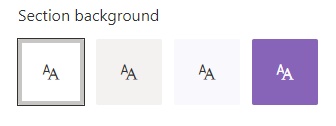
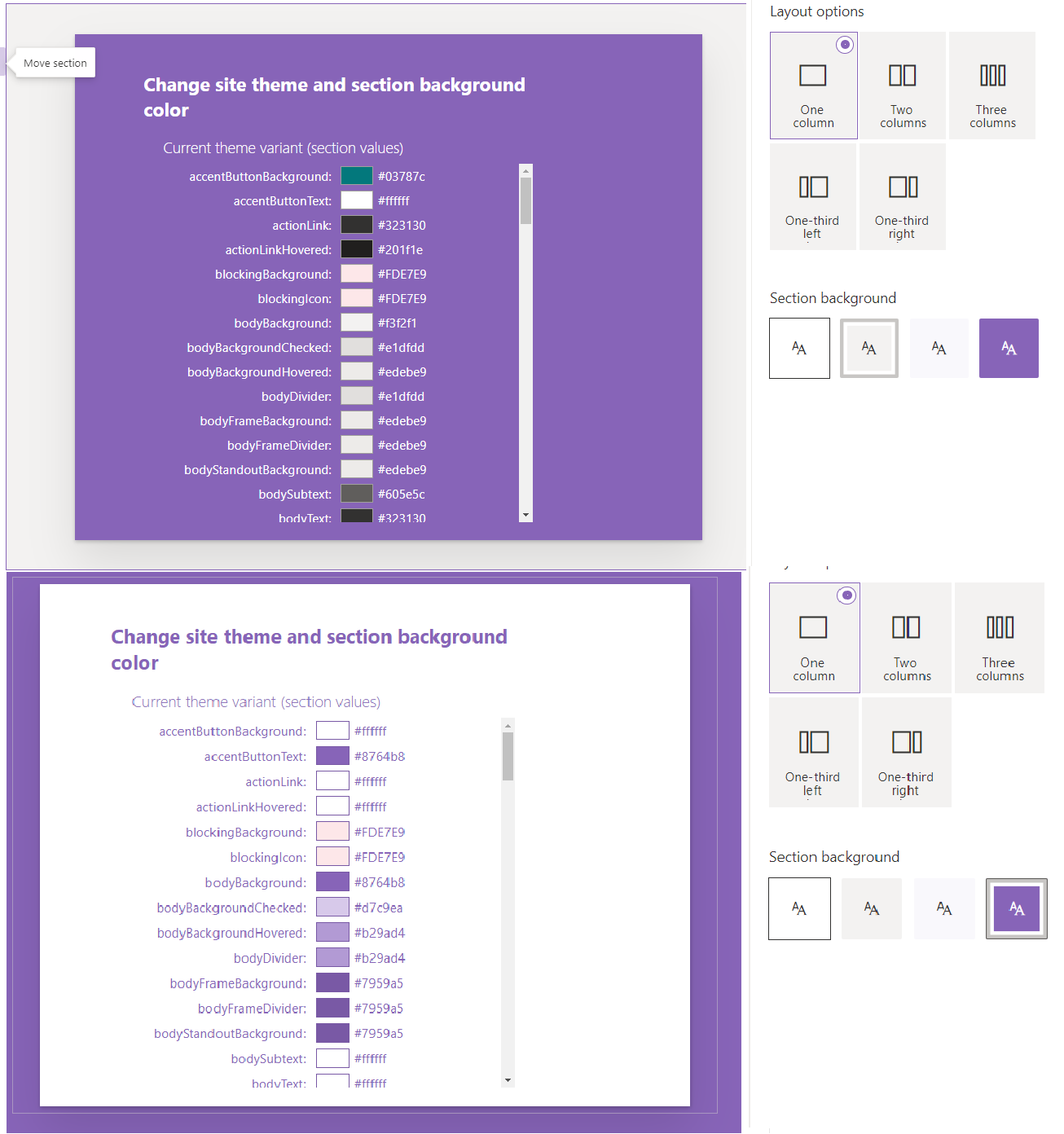
I think the CSS variable approach is the simpliest and most flexible of the patterns I have seen. Of course, you need to know the name of the semantic color you need, but that is not difficult to find. In the first project referenced below, I built a webpart that lists all of the semantic colors and shows the color assign based on the current theme and section background. Here is what the webpart looks like on two different section backgrounds, gray and purple.
The code shown in this post comes from two projects in the PnP SPFX Webparts Samples repo. You can find them at the following links:
https://github.com/pnp/sp-dev-fx-webparts/tree/master/samples/react-themes
https://github.com/pnp/sp-dev-fx-webparts/tree/master/samples/section-backgrounds
Both projects have additional patterns that you can explore, but hopefully you now have a better understanding of where the colors are so you can build your webparts to be more responsive to thier environment.
See ya soon!